Re-design process of designack.com (Part 2 of 2)
Posted on: 11 Aug 2014
Written by: Ngaire Ackerley
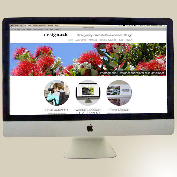
Further to last week’s post, I am continuing to discuss the thoughts I had and the process I went through when I recently re-designed and re-developed my WordPress portfolio site designack.com. I you missed last week’s post, where I discussed goals, brainstorming improvements and the sitemap – check out ‘Re-design process of designack.com (part 1)’ here »
To give you some idea of my previous website design and the initial setup on this new WordPress website, I’ve created a short screencast (no audio) to guide you through.
Website Wireframe
I like to sketch possible wireframe options and see what works and doesn’t as well as which templates can work well together to create a cohesive consistent design. Below are a few of many wireframes I sketched. I kept them very rough just as ideas initially to proceed into a more solid wireframe design in the next stage.
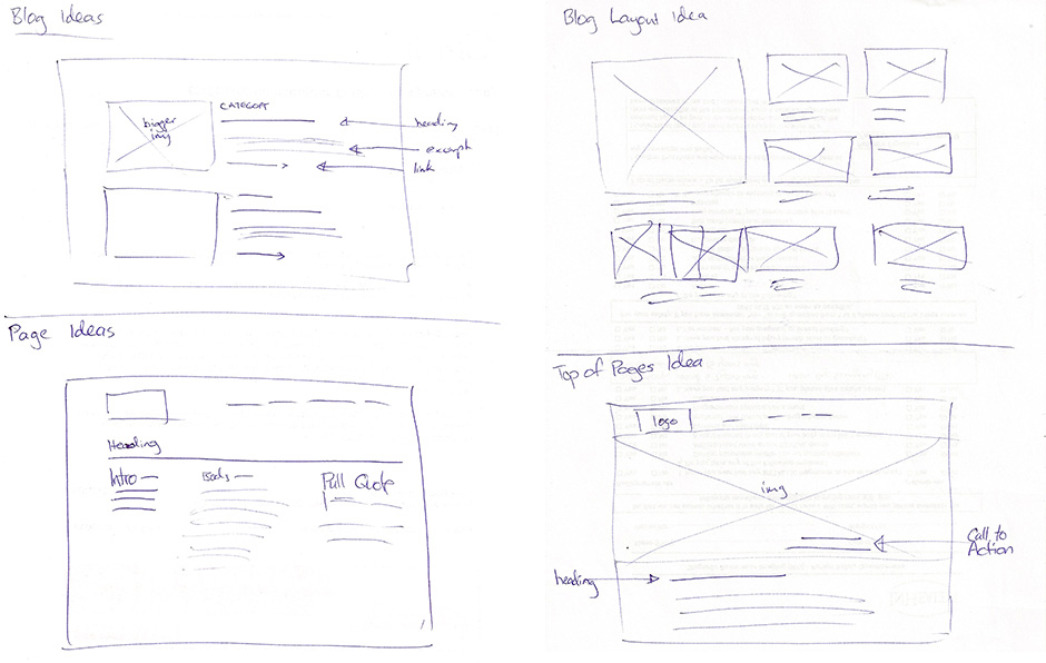
Designack.com wireframe ideas
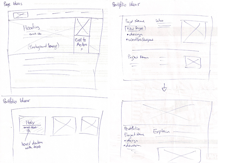
Designack.com wireframe ideas
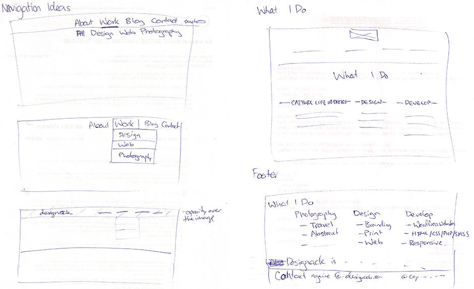
Designack.com wireframe ideas
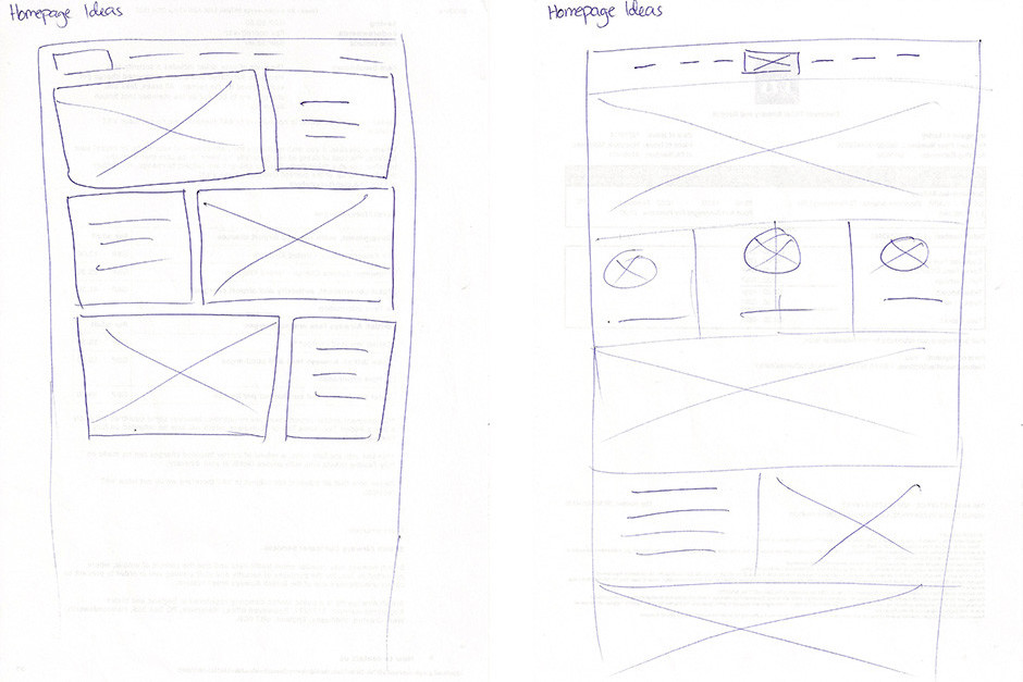
Designack.com wireframe homepage ideas
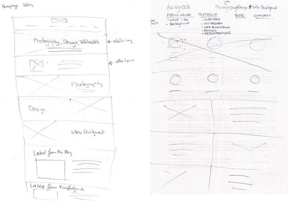
Designack.com wireframe homepage ideas
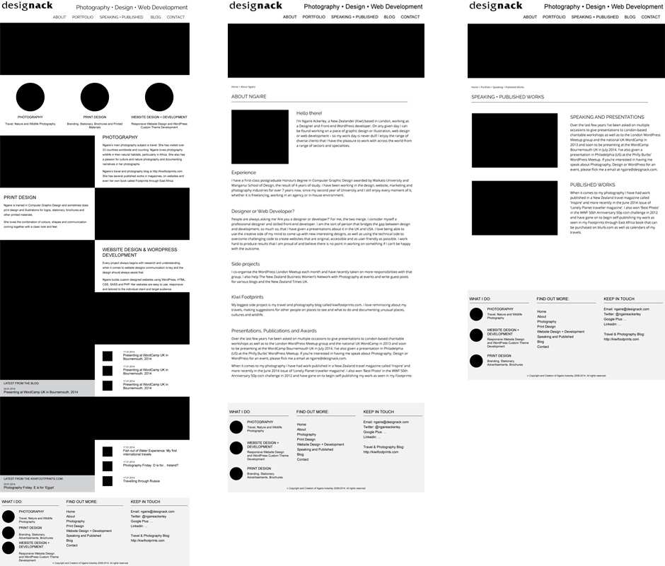
Website Design
From my preferred wireframe sketches I moved into InDesign to further develop the wireframes. I decided to leave colour out of the designs at this stage and add colour into the browser, because I knew it would be a lot more colourful with the amount of photography and being closer to full-width without sidebars.
Below is a selection of images from the wireframe-design process. You’ll notice variations as it is all process work.
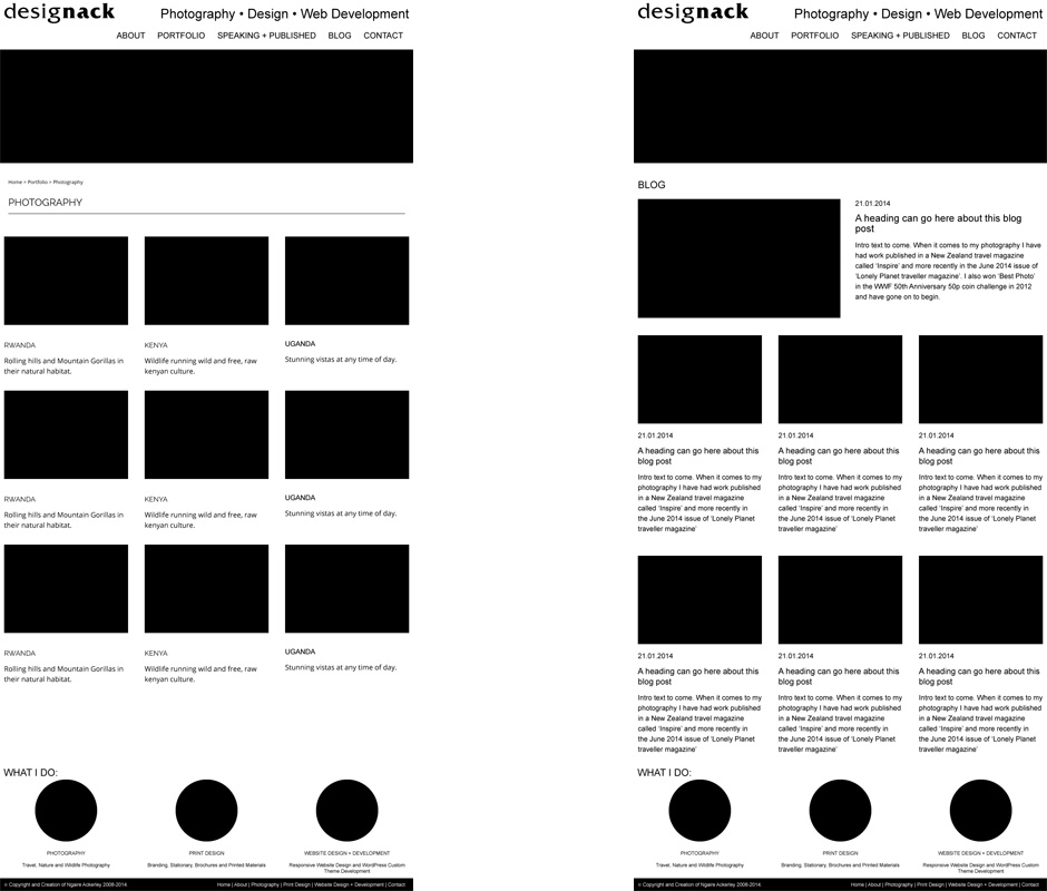
Wireframe-design process of photography portfolio and blog
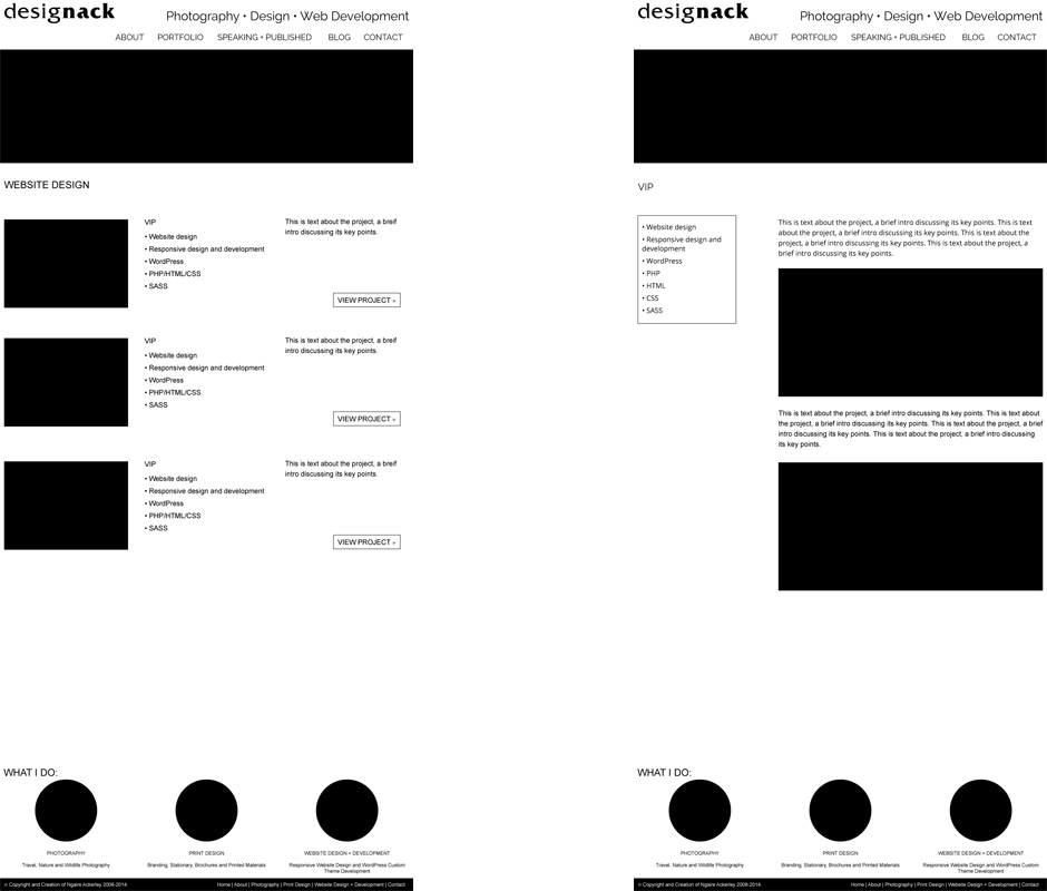
Website portfolio layouts
WordPress Development
Responsiveness and using sass were high priorities in this build. Keeping it cross browser and cross device friendly was vital. This means I used HTML 5 and CSS3 only when it wasn’t vital to the layout and design, because Internet Explorer often doesn’t like it. I can’t control who visits my website so I like to make it as accessible and user friendly as possible for anyone.
Responsive
I generally don’t develop mobile-first because I don’t like to add more JavaScript than absolutely necessary into the site. If I made it mobile first I would need for JavaScript to make the media queries work with older versions of Internet Explorer. Everyone is different and this is just my preference, because I like to keep the sites I develop as light as possible.
To create media queries I work from desktop width and move the browser window smaller, adding in media queries where the design doesn’t quite fit perfectly. That way, it doesn’t rely on specific mobile or tablet sizes (they are forever changing).
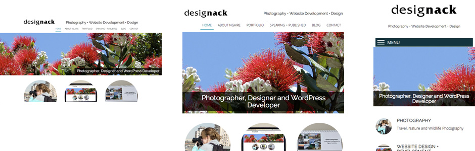
Responsive layouts of designack.com
Website Testing
Testing for devices and browsers goes hand in hand with development and responsiveness – keeping on top of it constantly. I used BrowserStack to do my checks as well as various devices and various content.
Adding content
Content needed to start to be added early on in development to get images to be fluid from the center or side depending on my preference where they were used. A lot of content was resized, most of the portfolio in fact. As I was getting far too close to my deadline I prioritised resizing images in my best photo galleries first and ended up just importing a few image sizes of the old galleries in from my last site to reach the deadline. We can’t all be perfect and I’d been working on this site for several weeks – I had to have an end point.
301 redirects and going live
Before I went live I compared the old site to my local site to work out all the necessary 301 redirects. I was moving hosts so there was always going to be a few hiccups, but I made sure it was early the week before I was due to give my presentation. I also didn’t tell people the new site was live for several days to give me time to do several checks – in case images or links were missing.
Reflection
I achieved my goals of making the site easier to update and add pieces to the portfolio sections and the navigation and galleries are a lot better in terms of how they look and their functionality. Changing the type of gallery functionality was a great decision. The site now allows people to see all the images in a gallery and they just need to click to view the images larger. This way, people don’t miss out on any images in large galleries by getting sick of scrolling through images one at a time (as previously used). The gallery plugin allows for different dimension images and all slot in nicely in a fluid and responsive layout.
I’m not 100% set on the homepage design. This is the most important page and I feel it is too busy and doesn’t point the user in a certain direction clearly enough. That being said, because I still use this site heavily as a portfolio for photography, design and website development it is difficult to point people in just one direction. If I move to publishing more photography or being more of a freelance designer/developer in the future, I may consider splitting this out into different websites.
For the time being, it is a fresh new design. It is responsive and user friendly. There is paid work to be done so I can’t keep adjusting the design of this site all the time. I’ll review it in a year’s time to decide if further adjustments should be done.
« Back to Blog