Photographing for a website
Posted on: 4 Mar 2012
Written by: Ngaire Ackerley
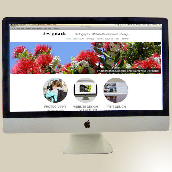
Photography on websites can be a simple or complex challenge depending on the type of site and type of photographs that are used. I can’t describe enough how important photography is for a web presence. It helps set the stage for the website and can say a lot about the company, product or project before the user even reads any text.
I work on a daily basis with both photography, website design and development and think that this is a topic that is sometimes not thought about as much as it should be. Some people often use their own images rather than hiring a photographer to take photographs for their website which is entirely understandable. Other people do hire photographers, but often photographers are not told the sort of images the website will require. So hopefully this blog post will be useful for a range of people thinking about photography for a website. I have tried to avoid being too technical, but these points are easily looked up, otherwise I welcome questions, comments and feedback at ngaire@designack.com.
If you’re doing your own photography for a website:
Consider the dimensions of the banner/slideshow photographs
Generally website slideshows and banner images are horizontal with limited height. Consider the ratio that your website uses for these images. It may be 1:2 or 2:3 or something similar. When taking the photograph keep this size and ratio in mind and it doesn’t hurt to take a step or two extra backwards so that you have plenty of room to crop the image to the correct dimensions without losing the subject matter that you want in the image.
Consider the page layout where photographs may feature
Many web pages can allow for images to go alongside text. There may be a specific position for images on the web page, whether it is within the sidebar or main content area. In both these instances it is important to once again consider the dimensions of the photograph and user. Users will not want to scroll too much to get to the text on the page, so if the image is portrait-format (vertical) then consider limiting the height to prevent users leaving the page before reading the text below. Likewise, if an image is landscape-format (horizontal) consider if it should take the full width of the content area or not. If it does, the text will have to go above or below, if it doesn’t span the full width, will you be able to see the subject matter in the image clearly enough?

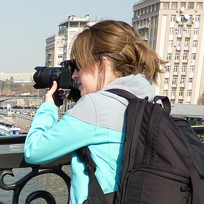
‘About Ngaire’ – on this page I have used a portrait-format photograph, right aligned, so that the text is visible immediately.
Consider composition and subject matter in your photographs
We have no control over the users of websites. Therefore we must cater for those that have poor eyesight. Consider using images that are clear and show the desired subject matter without too much clutter in the background. If the background is busy, consider using a different depth of field to blur the background slightly to help make the subject matter stand out more.
Consider the colour scheme of photographs and websites
If you are planning on using large images on a website, it is useful to consider if the colours in the photographs will clash with the colour scheme of the website. You may be able to use smaller images without too much colour-concern, but larger images should be considered more carefully because they will be more obvious to users of the website.
Consider the frame and crop of photographs

This artist has his body cropped, but his face, hands and artwork are visible.
Often subject matter within a photograph will have to be cropped to fit the website image dimensions in ways we’d rather not. However, consider the best way of doing the crop. Would you rather loose part of someone’s arm or torso or their head? Is what a person looking at just as important as the person himself/herself or does that add to the mood and narrative that the photograph portrays?
Consider quality of photographs
With handheld and mobile devices these days we can produce a lot of different imagery at different qualities. While a smartphone may take a photograph, consider how blurry it may be and how large it will feature on your website. A bad quality image can reflect on your company, product or project profile in a less desirable way if you’re not careful. I’m not saying smartphone’s are not suitable at all, some have excellent cameras and when they are held steady can create a perfectly good photograph for a website, but quality is still an important point to consider.
Consider image file size
The larger the image file size is, the longer it takes to load on a website. Not everyone in every country has high-speed Internet connection and mobile devices are often not as fast as desktop devices either.
This point has a few layers to it. Basically, if you take a photograph on a good-quality camera with high megapixels, it will produce a large image file size at good quality. This needs to be optimised for the web without loosing clarity. If a photograph has been taken at lower megapixels or on a mobile device it will be a smaller file size, but the quality may also be low. This means that you need to be careful when optimising the image because clarity will be lost a lot easier because you started with a lower quality image.

This is an example of Optimising an image in Photoshop – by using the ‘Save for Web’ option
If you’re hiring a photographer:
Make them aware of the location the photograph will feature on the website
If it is a banner or slideshow photograph, make sure the photographer is aware of the dimensions and ratio of the images. If the photographs are for a profile page of people, decide if you want square, portrait or landscape images and provide your photographer with these dimensions.
Ask your web designer/developer for the image optimisation specifications and explain these to your photographer
If your photographer is providing you with web-ready images, make sure they are optimised for the web correctly. This includes the colour mode (RGB), the resolution (72dpi in most instances), format (jpg, png or gif), dimensions (in pixels) and desired file sizes (in kilobytes, megabytes will usually be too large). Some website designers/developers may also ask for a variety of sizes if background images are used for responsive web design on varying devices ie. android phone, iphone, ipad, laptop, desktop computer.
There is so much more I could include in this post, but hopefully this has covered the key areas that need to be considered when photographing for a website. If you have any further tips or suggestions, please let me know.
« Back to Blog