Class enrolments UX redesign
What I was responsible for in this project:
- Website investigation/review
- User testing
- Functional research
- User journey flows
- User type identification
- Low-fi wireframes
- Prototype digital wireframes
Overview
This project began with a need to investigate what the students problems were with digital class enrolments at Auckland University of Technology (AUT), so I could identify and recommend a way forward to improve the system.
Initial user research showed that students came to the class enrolment section generally knowing what papers they wanted to study, but struggled to see all the classes easily and figure out a clash-free class timetable. This became the focus of the project for me to create a system where students could see their class options clearly and create a timetable easily.
User research
- User interviews
- User research analysis
- Brief and recommendations
I sent out a survey off the back of a response to another user research project I had done to locate students willing to participate in some user testing sessions in return for a voucher. From the responses, I organised times to meet with a variety of students from different programs of study, year levels and locations.
I asked the students to log into the system themselves and show me how they would enrol in classes. I asked them to talk me through their process and what they were thinking/feeling along the way. I had prepared various questions that weren’t leading to ask along the way and once they’d completed their walk-through.
I compiled the interview results into a document that went alongside a recommendation of next steps in the project.
Investigation
- Creating a knowledge document from discussions
I quickly found I needed to research and contact multiple people across the University to find out how the current system worked, what was necessary to keep, what could be changed and how the different functions all interacted with each other. In doing this I decided to create a ‘knowledge’ document for the continuation of this project, because it was likely to continue past the end of my contract in terms of development and no such document existed about the system.
This ‘knowledge’ document grew as my research continued and was fleshed out with various types of users as well. This should help developers and testers when the time comes to develop designs.
The exisiting system was desktop only and didn’t work properly on IOS devices (the calendar timetable was missing). Additionally it was expressed it would be good to have it as part of an app as well as a responsive website. However, with the amount of information involved it was likely that desktop would need to be the initial focus. The system would be responsive, but mainly used on desktop screens with the calendar potentially used more than the enrolments on smaller screens.
Along the way I discovered that some students had created a class wizard program for one of their projects that automatically generated timetables for students based on their papers and filter preferences. I spoke to one of the students that was involved in the project during my investigation to find out more, with the potential that this could be incorporated into this project. They had heavily edited the timetable data for it to work, but the idea was still there.
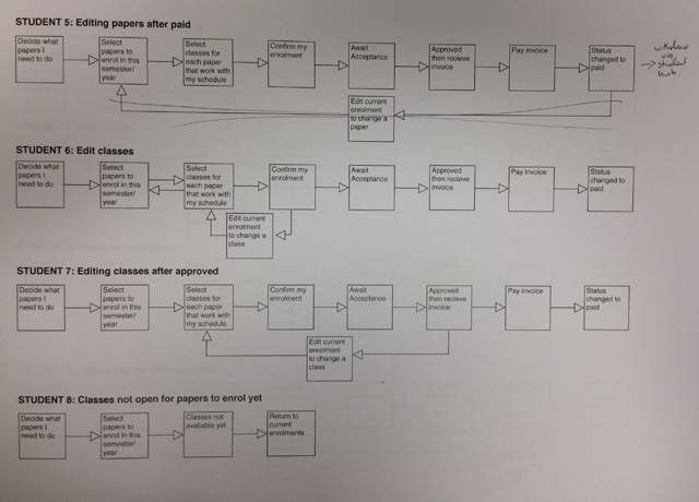
User flows and types
- User journeys
- User personas
From my user testing and research I was able to create some basic user flows and personas, which would be fleshed out over time as the project evolved and more was discovered and designed for.
It was important to note where the students would be able to edit their enrolments and where they weren’t. However, until it came to development stage I wouldn’t know all the business rules and requirements, so I needed to keep that in mind.
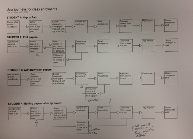
A few of the basic user journeys
Wireframes and Prototyping
- Low-fidelity wireframe sketches
- Demos
- Informal user testing
- Re-thinking ideas
- Prototyping
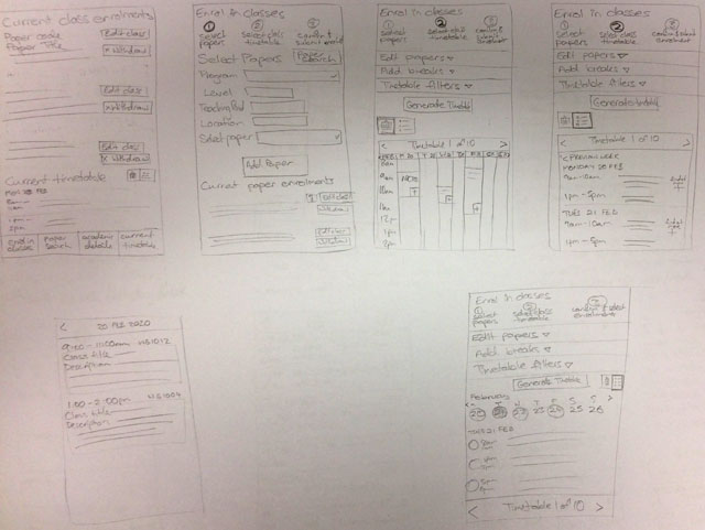
I created low-fi wireframe sketches with various directions and options. Stepping through each one from the user perspective and discussions with my manager helped them be refined to the point that I could prototype the wireframes into something more functional.
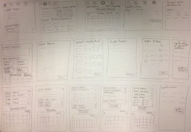
Very rough sketches of a few of my initial ideas
As I saw potential I fleshed out the ideas in a bit more detail
The initial direction was a step-by-step flow that expanded open at each stage and timetable wizard that students were able to add filters to, add breaks and adjust. However, this felt like it was going down the wrong route, focusing too much on creating a timetable for students rather than letting them create their own. Not to mention I was including too much new functionality that would not get into development for a long time.
For the first concept I sketched and made notes of things to consider and look into more
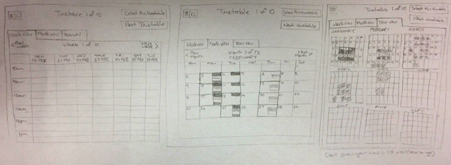
Possible ideas for desktop calendar, but would want to show class information inside them
Still considered mobile to see how it ‘could’ work early on
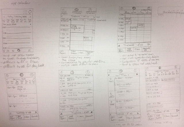
Considered potential issues with each small screen idea
I returned back to my initial brief and user testing results. Focusing back on the key problems of students not being able to see all their class options at once for a paper. The ability to create a clash-free timetable might still be able to be included in a simpler and more straightforward manner.
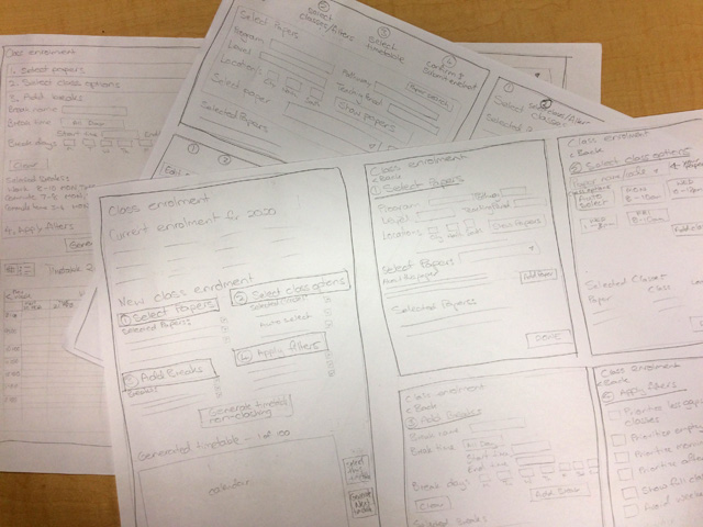
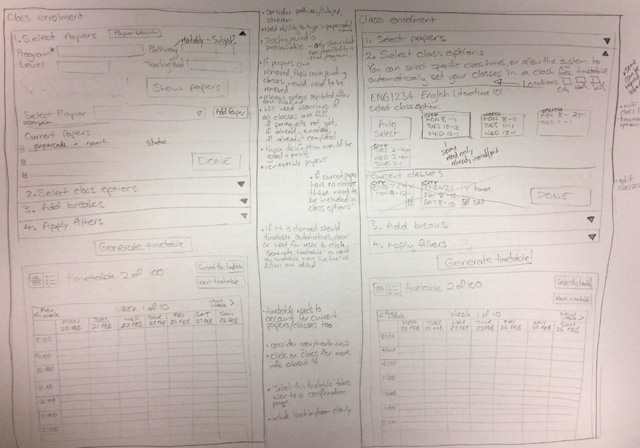
I continued to sketch new wireframe ideas, not entirely throwing away previous ones, but going back to the current design and working this new idea from that.
Rethinking the wireframes with a new direction
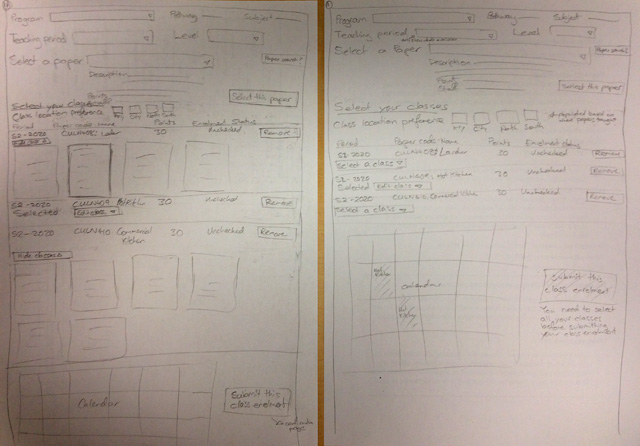
As this progressed, I moved the sketches into Adobe XD to create an interactive prototype — still keeping to black, grey and white boxes to keep the focus on usability and functionality before colour and design was added.
I did a user test with a fellow colleague and part time international student. I asked her to click through my prototype in a few different scenarios, explaining her thinking and feelings along the way, so I could see where she clicked and what her thought process was.
Straight away I noticed some key aspects that could be amended to improve the user experience, which was great and made sense. Other aspects would need to be tested with more students from other courses and backgrounds to get a more solid idea of preferences and what changes were necessary. Before I showed full-time students though, I would need to refine the prototype wireframe further.
I also demoed the prototypes to various other managers and part-time students in the ICT department for further feedback — what was possible, not possible and realistic from a development perspective.
A few basic screens on some of the prototypes in XD
Refinement and user testing
- Refining prototypes
- Informal user testing
- Formal user testing
- Analysis
- Design updates
- Interaction/design documentation for developers
As the wireframe concepts came together in a few different prototypes, I returned to these colleagues and a few new ones to gather more insights and feedback, so that I could compile one complete prototype of scenarios for full-time students to test. It was important to remember that while some of the feedback was beneficial from colleagues that were students, they were not the main users, so I noted some feedback to see if it was relevant with actual full-time students as well.
I contacted previous interview students and asked if they knew any other full-time students from other courses/levels that might be interested in also participating in this new round of user testing. This turned out to be a great way to locate participants.
From here I undertook more user testing interviews with students from different levels and programs in a one-to-one situation. I asked participants to go through a couple of scenarios with my designed prototype (created in Adobe XD), talking me through their process as they went and how they felt about the process. After each scenario I asked a couple of questions based on their interactions and the flow they were testing without being leading or affecting the next scenario.
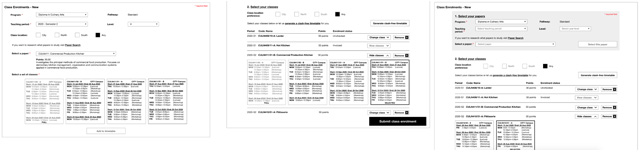
User testing and analysis was done with recommendations of the flow to proceed with. This flow was adding papers and then classes, rather than classes immediately (which was the other flow). This would provide more flexibility in creating a clash-free timetable with fewer adjustments needed and also allow for auto-generation to happen. Minor adjustments were made to the design and an interaction document was updated for developers.
My current design prototype was limited to one program of study, and while I did create a few flat designs of each testing participants program it would have taken too much time to configure the entire prototype for each user test. However, the way the user testing sessions were undertaken still allowed realistic results, by students imagining they were in this program of study and needed to add certain papers/select classes.
Ideally once developers have a working prototype that allows students to add their own papers from their degree/program then more user testing would be useful. This will help confirm that the flow works as expected creating a good user experience. Further tweaks may be necessary and more styling to suit the website platform that it goes into.
This project is ongoing.