Digital Annual Plan redesign
What I was responsible for in this project:
- User research, journeys, personas
- Hi/Lo-fi wireframes
- User experience design and interactions
- Functional research and recommendations
- CSS/HTML assistance
- User story writing
- User testing
- Stakeholder and project management/presentations
- Guidance/mentoring BAs
Project Overview
Auckland University of Technology (AUT) had two existing staff Annual Plans, one for Academic and one for Professional staff. My role was to come in and review the current plans, provide recommendations and do redesign for new ones to be developed. I was on a fixed term contract so had the mindset to create a successful project and leave the team with suggested user testing/surveys, user stories and improvements for the future.
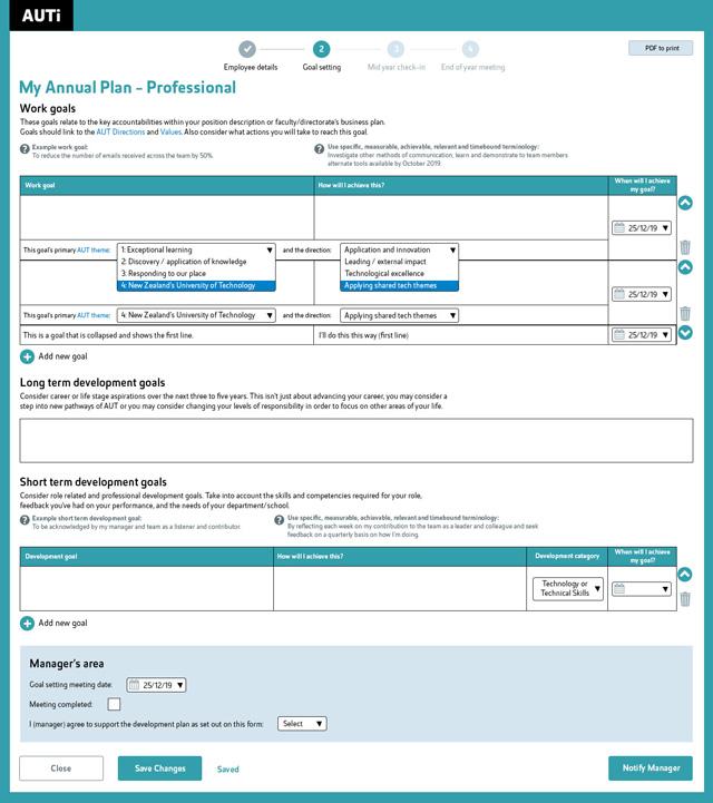
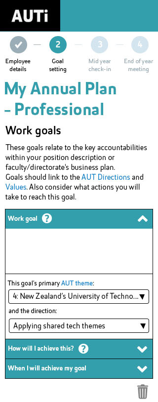
Example of a goal setting page in the Professional Annual Plan redesign
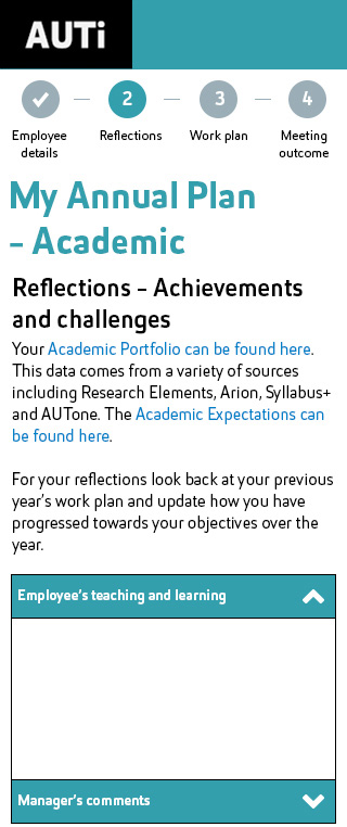
User research and analysis
- Survey users (stakeholder assistance)
- UX review/recommendations/user flow
- Presenting findings/recommendations
Having never used AUT’s digital annual plans before I needed to fully understand how they functioned and what the user experience was like. From there I assisted the stakeholders in a brief user survey. They sent this out to staff to gain initial feedback on the current system to highlight key points that needed to be improved. Unfortunately this went out to both Academic and Professional staff at the same time. This meant the results were combined and took time to understand which responses were related to which type of annual plan (as they were slightly different in layouts and processes). It retrospect, I would have asked more questions about how the survey was being sent out and offered more assistance in that process.
I analysed and presented the results of the survey and my recommendations back to the stakeholders and project team. These were referred to throughout the project when presenting to developers, users etc. so that we were always reminded why we were making these changes.
Two pages of the previous annual plans that I was redesigning.
Combining results and recommendations with a few pieces of additional functionality I was able plan out an improved user flow, cutting down the amount of pages and content users needed to go through. I also identified key functionality that could be changed to create an easier and more pleasant user experience, such as replacing modals for goals with extendable text boxes.
The key users were both Academic and Professional employees and managers. Some staff would have multiple managers and some managers would have both Professional and Academic staff. Each would be able to fill out certain areas of the annual plans and have their comments function as read-only by the other person.
Wireframes
- Low-fi wireframe sketching of flows
- Consider new enhancements
- Functional research + discussions with developers and stakeholders
- Presenting wireframes to stakeholders + developers
Before I started sketching low-fi wireframes I researched a few key pieces of improved functionality to ensure my recommendations were possible. One of the issues users had was that the text boxes required several clicks to get to and were too small for writing goals inside a modal. Then to read them you had a small area that had to be scrolled. In thinking about this and researching I looked into auto-extendable text boxes that didn’t require a modal, so that users could enter more text easily without having to scroll through a small modal text box. I spoke to both stakeholders and developers about solutions like these to ensure what I was going to design would be possible and useful.
New enhancements needed to be included to relate goals to the AUT themes and directions. While almost everything was optional to fill out, these aspects still needed to be designed in a way that would be encouraging and easy to fill out. I designed auto-populated select boxes to sit below each goal, that would populate the direction based on the theme the staff member selected. This would be a key area to consider in user testing.
Sketching out user flows in the form of rough wireframes is always where my designs start to take shape. I spend time fleshing out ideas, scrubbing ones that don’t make sense and finding holes that need clarification before they get adjusted. I would speak to the stakeholders about aspects such as reducing the content and combining fields, explaining why this would be beneficial to the users and provide more accurate goal setting.
Once the sketches were in a state that is understandable, I shared these with the stakeholders and then developers before they were approved to become digital designs. Due to time the only user testing done was within the project team at this stage. Ideally we would have run these through with more staff at an early stage.
Designs
- Checking brand requirements
- Hi-fi designs
- Presenting to project team
- User testing/presentations (with stakeholders)
- Always referring back to user research and UX recommendations
- Suggested copywriting
I consulted the brand department early with my first page of hi-fi designs to ensure they were following the internal digital brand guidelines when it came to the UI design.
Additional aspects of functionality were researched and included to improve the user experience along the way. These included aspects such as the ability to expand and collapse individual goal rows, reducing text and modals.
Additional pages were also designed for staff to access the annual plans easier – less entry points, more directive, less chance of creating multiple versions accidentally. The downloadable .pdf was also redesigned for each annual plan to be clean, clear and understandable (and on brand).
Throughout the designs I made suggested copy changes and referred the stakeholders to these to edit. I am not a copywriter but produced copy that demonstrated what would be beneficial to the user to read. Often the stakeholders left it as I had written and sometimes edited it from their knowledge of Academic and Professional staff.
I created designs to be responsive down to 320px (iPhone5) and up to a standard desktop screen. I also provided a few examples of how the pages could look at a tablet breakpoint when the design would need to adjust its layout.
Together with one of the stakeholders we presented the designs to two groups of users. During the presentations I explained what the initial user feedback was and explained the new designs relating back to the feedback. They were incredibly well received by both Academic and Professional staff.
Time was limited so unfortunately proper interactive user testing would happen during development. However, looking back if I could have made time to do a few weeks of interactive user testing of the prototypes I think this would have been beneficial.
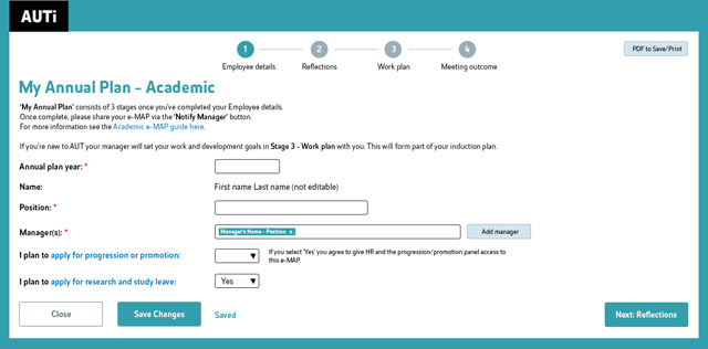
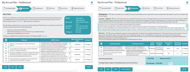
Example of the first page of the Academic Annual Plan.
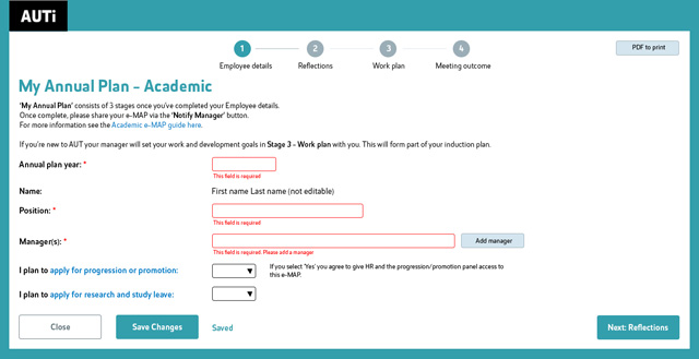
For the few required fields in the design I provided error messaging examples
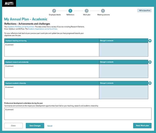
Academic annual plan – page 2 design with expandable fields
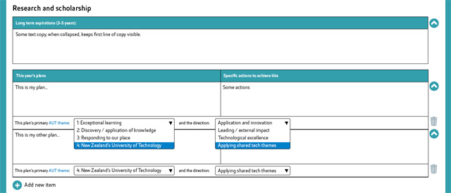
The annual plan had a requirement of including the AUT themes and directions to each goal.
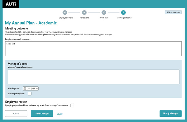
Final meeting page of the Academic annual plan
Example of what the intension was for the mobile design for Academic.
Development
- Responsive designs
- CSS/Interaction document for developers
- Refine design scope for capabilities and timeframe
- User story writing/education for other BA’s
Prior to going into development I ensured the stakeholders and developers were happy with the responsive designs.
I created a CSS/Interaction document explaining aspects of the designs for the developers to speed up their processes and assist consistency across both the Academic and Professional annual plans. This detailed key elements on each page, variables and changes that would appear between the different screen sizes. This also fed into detailed user stories for the development team and tester.
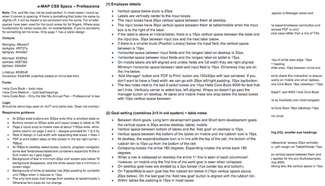
Example of the few page snippets of the CSS/Interaction document I provided the developers and tester for each annual plan.
During the early stages of development it was realised that the designs would not be able to be achieved in the timeframe with the skill level of the developers. Therefore, key decisions were made in the project team such as reducing the designs down to desktop only (since that was the main screen size used for filling out the annual plans). I made edits to the designs and user stories as we needed to refine scope to make the project achievable in the timeframe with the development capacity that we had. I would look at the designs and decide how we could create them with an MVP mindset while still including user experience improvements based on initial feedback. Based on my recommendations I explained the reasoning for the various changes to stakeholders and the project manager so we could remove or reduce priority of some functionality and styling.
I refined the user stories to be smaller, more achievable and accurate which resulted in increased productivity of the developers. These have been used several times to educate/mentor business analysts on how to create successful user story writing for the developers in the department. Detail was key with this team, as well as clear acceptance criteria, coming from both a development and testing perspective.
In retrospect, I would have asked for a clearer understanding of timeframes, capacity and capabilities. While I did ask some questions about this early on, I could have explained clearer why it was important so that the designs could have been more appropriate for the developers initially. However, creating a full design still provided plenty of improvements that could be included when there was extra time and suggestions post-user testing for future enhancements.
Example of a goal setting page in the Professional Annual Plan redesign
Responsive design for mobile for the Professional Annual Plan, including collapsible/expandable areas for long text.
User testing
- Interactive user testing (assistance of BA/Project manager due to my workload)
- Analysis of user testing
- Recommendations of edits/improvements and considerations
- Presenting results to stakeholders
- Future user testing/improvements
Due to my priorities with other projects at the time, the final user testing was undertaken with assistance of the project manager and business analyst also. I explained to them how I would do user testing and for the first couple of sessions with Academic staff my colleagues were the ones to take notes. The project manager and I undertook the last few sessions together and all of Professional staff user testing.
It was not too late to do the user testing, because both projects still had time and capacity to make changes, we were just lucky that none of the feedback or findings would cause too much development changes. Simple things like Academic staff being more comfortable with the word ‘plan’ rather than ‘goals’ could be incorporated without any issues.
We highlighted key bits of refinement that would be good to do before we go live with the project and future aspects that could be tested on once the annual plans were being widely used. The project manager and I spoke to the stakeholders and kept them well informed throughout the project and explain any necessary changes incase they had any input.
I assisted with functional and design testing when I had time and answered any questions developers or testers had throughout the project. I was involved in many of the agile meetings to provide clarity to anything necessary early on.
Before we went live with each annual plan I also compiled questions that could go out in survey format to be easily analysed once my contract had ended. I created user stories in the backlog for future development with options based on the outcomes of the future surveys. Because the annual plans are filled out throughout the year, they ideally need to be continually tested at each stage to gain feedback, confirmation and improvements.
This project also saw education around user experience design in a team that has never really had a UX or UI Designer on staff. I was also highly involved in the agile team, writing user stories and sharing the knowledge of how to create these successfully with the Business Analysts. Every team is different and this one needed a lot of detail in the user stories and have them broken into small pieces of functionality so that they could easily develop, test and release aspects to make progress during each sprint.
Both annual plans launched within their timeframe and now are being monitored for feedback before the first user surveys go out once people have started creating their annual plans for the year.