NZ Herald Subscriptions + Paywall
What I was responsible for in this project:
- User experience design and interactions
- UX testing
- UX research and planning
- User flows
- Wireframes
- Responsive UI design
- Cross browser/device testing
UX Design process
Users were my focus during this design process. From early on I was involved in business priorities and functionality, which enabled me to create user flows and co-ordinate meetings to flesh these out and discover happy and unhappy paths. Doing this early in the project allowed developers and testers to start thinking about functionality and see the project come to life.
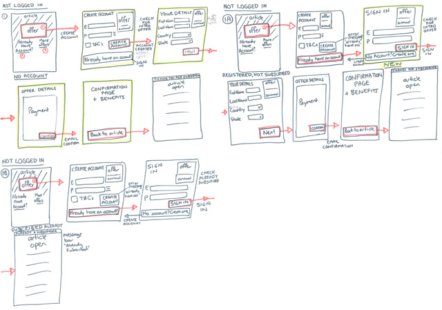
Example draft user flow
Design research was done based on what other providers do as well as other industries and design inspiration from completely different areas also. Consideration also needed to be given to the platform being used and what would be possible. Combined with best UX practices and web design principles the wireframes and user interface came to life to provide a unique experience for our users.
User testing
Throughout the project I did user testing in areas that were not business-sensitive and could gather feedback to improve the UX, UI and accessibility of the project. Examples include the indicator style and colours.
Examples of user tests for the premium indicator
![]()
![]()
Through various tests and discussions we settled on a dark gold colour with a clean black font and a golden pinline. This was to be used on both index listing pages and article templates.

Example of premium content on homepage
Design from wireframes to final user interfaces
The entire flow needed to be as frictionless as possible, with appropriate feedback to the user where suitable and encouraging. Many aspects of the flow needed to allow multiple user actions – such as choosing an offer, signing in if you were already a subscriber or if you were already a registered user, or activating your subscription for certain print subscribers.

The offers page is home to multiple offers

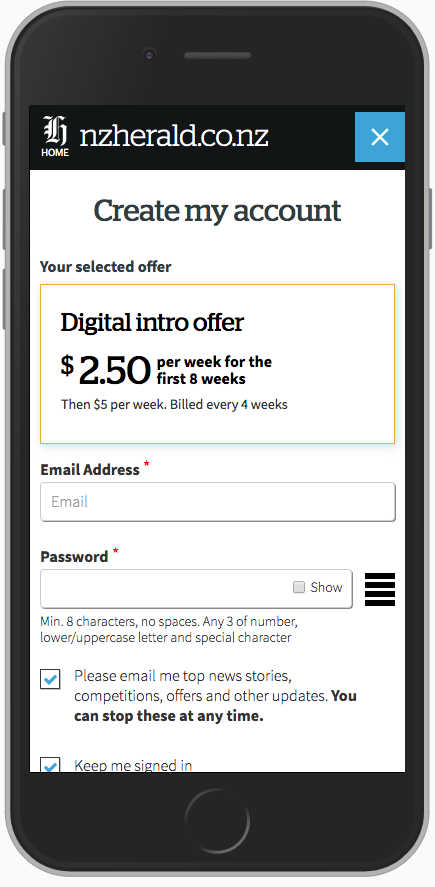
Responsive mobile view of the offers page
I maintained a similar ‘Create Account’ screen to the registration flow and style for consistency, while bringing in the golden premium colour. Only key information required was collected throughout the subscription process.
Updates to the Profile area were made for managing a users subscription and signing up to premium newsletters.
Consideration also needed to be given for existing print subscribers and future print+digital subscribers. Error messaging, dialogues and new password flows were also considered throughout the project.
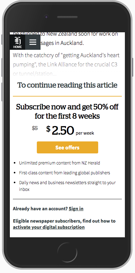
The article paywall needed to be clean and encouraging, while letting subscribers also sign in easily
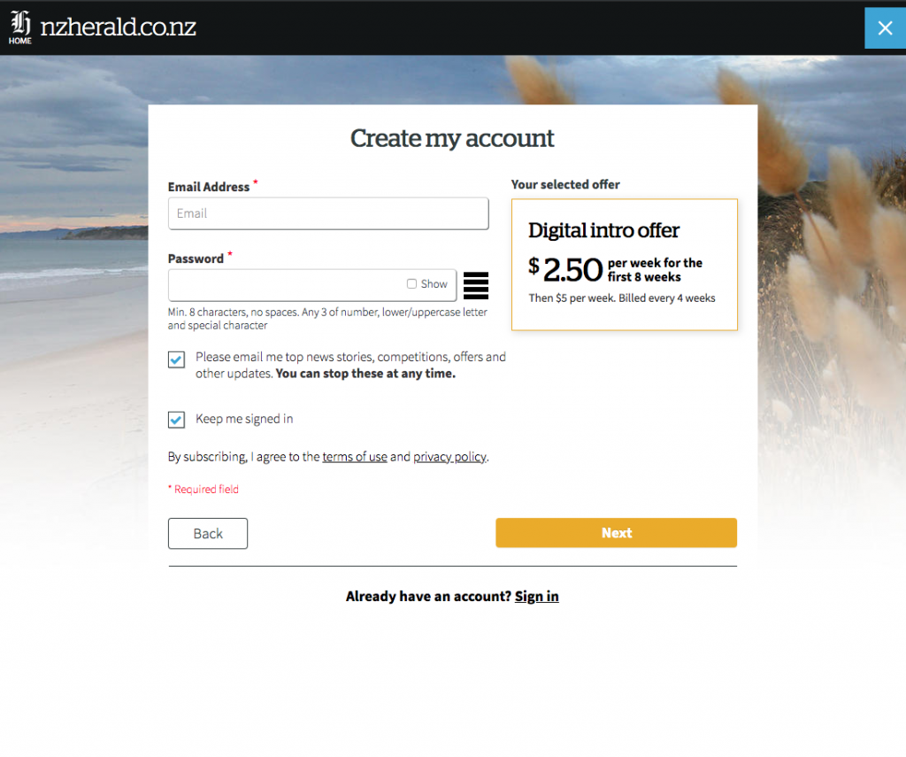
Create account page for subscriptions – desktop view
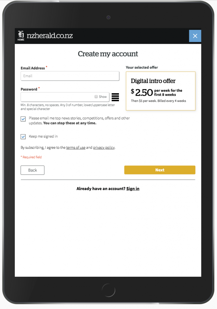
All designs needed to be smoothly responsive across all screen sizes
Upon selecting an offer, it’s important the user knows what they have selected, this is maintained throughout the flow for transparency
Article templates
The premium style content needed to work within the standard article design and a new ‘big read’ design to give the premium content a point of difference and premium feel, with less advertising and items on the page.

It was important to design to create the best experience possible no matter the size or shape of the browser or device
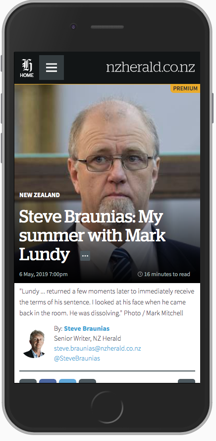
Example of the new ‘Big read’ premium template on mobile
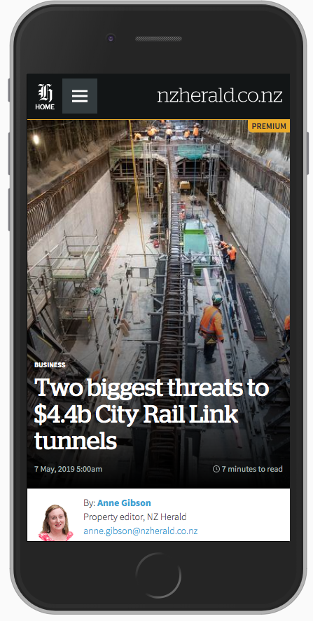
Example of premium indicator in a standard premium article template
Responsive designs were created to fit a minimum of an iPhone5/SE (320px wide) and were tested extensively across a wide range of browsers and devices.
During this project I also managed a digital design contractor that assisted with some of the UI work. I also worked extensively with developers, product managers, testers and people within other areas of the business.
This is an ongoing project, but initial launch feedback has been fantastic with plenty of people expressing how easy and nice it was to subscribe to premium content.