UX in responsive design
Posted on: 2 Apr 2019
Written by: Ngaire Ackerley
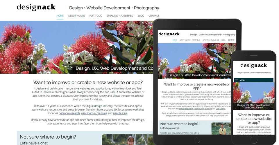
Homepage example of desktop – tablet – mobile responsive design
These days our websites and applications can be viewed on a vast amount of devices and screen sizes.
Smartphones can be pocket sized or verging on tablet size. They can rotate too.
Tablets range from big phones to nearly laptops, as many now come with fold away keyboards. Then there is also laptops from small 10-11inch to 17inch+.
Desktop computers come with a vast variety of screen size options and varying quality options.

Home screen designed for WatchMe TV application for Vodafone’s TV Box
There’s television now too. Smart TV’s often have web browsers and apps, with a whole other type of navigation. Then there’s all the TV-related devices that load applications onto your TV. With television screens we tend to sit further away than the other situations, which adds extra complexity into the design too.
The list of devices and screen size options is forever growing. As well as resolutions (don’t forget the lovely iPhoneX and iPad Pro’s that now take icons 3x the original size).
With analytics we may be able to see our most-popular devices and screen sizes, but it’s important to keep in mind that companies are always bringing out new devices – while analytics is a great starting point, we can’t just design and develop for specifics. We have to consider how devices may change in the future too.
This is where responsive design comes into play. Quality UX is part of responsive design.
Responsive design
Responsive design is about adjusting the layout to fit nicely into the space available. For instance as you drag the internet browser window smaller, you’ll see this website adjust its elements to fit the space better. This website was designed a few years ago so it’s by no means a perfect example, but it gives you an idea of what I’m talking about.
On some sites you may see changes to navigation, font size, icons and buttons to better suit the screen size you’re viewing the website on, this is where a good user experience can be considered in more detail. It’s more than just adjusting containers.
User experience as part of responsive design
When it comes to the user experience side of responsive design, it’s all about making elements fit the screen appropriately for the user, purpose and interaction. For instance, it is pretty safe to say as I’m browsing a website on my mobile, I will be holding it relatively close. Whereas, if I’m browsing an app or website on my smart television, I may sit a couple of meters away.
This also means on a phone I’m likely to be touching links, buttons, images , etc., so the touch areas need to fit large fingers. Compare that to a desktop computer, where larger buttons for touch actions would look chunky and out of place, because most of us use a mouse/cursor to navigate (though there are definitely exceptions here).
Example of top level desktop navigation
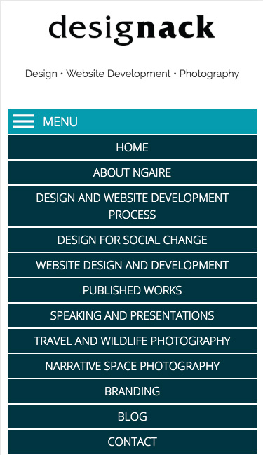
Example of mobile navigation – not perfect, but definitely easier for fingers
I can’t tell you in a single blog post how to do the best UX responsive design, but I wanted to raise it as a consideration as part of my UX series. The main point I want to make is that we need to consider the UX design of a website or app at different breakpoints in a way that is more than just rearranging elements. Think about the user at each breakpoint.
- What sort of device/s are they likely to be using?
- Are they using their fingers or another device?
- How close to the screen are they likely to be?
- Can you provide an easier way to fill out form fields?
- Can we make the most of native functionality that the user is used to on that device?
The list goes on.
Testing out devices and how they work
Wherever possible, as a designer I highly recommend testing out actual devices your users will be using. Whether that is small and large smart tvs, smart remotes or app box remotes. The iPhoneX series now has a notch and the quality of your website and app will look different due to the change in resolution on these phones and the new iPad Pros.
It can be an expensive exercise testing devices/screens, but one that is worth considering for the best possible user experience across devices and different types of screens.
Extra reading:
Adaptive vs. Responsive Design: https://www.interaction-design.org/literature/article/adaptive-vs-responsive-design
Is Responsive Design Dead? https://uxdesign.cc/stop-using-responsive-design-f0922e7882b2
Material Design: https://material.io/
IOS Interface Design Guidelines: https://developer.apple.com/design/human-interface-guidelines/